
Booking Booster
Housing rental platform optimization project
Company
Role
Duration
Finpeak
UX Designer
6 Weeks


I initiated the launched project called "Booking Booster" to help Airnect.com enhance users' trust and confidence. We optimized the user flow and fixed issues to smooth the booking process and decrease the drop-off rate with 3 solutions.
the business challenge

At the early stage of Airnect's development. We gained many users (guests), but our guests barely chose to book a house on Airnect. The chart shows how users decrease through the process.
Sign up
Browse listing
Find a desire space
Send an request
Negotiate price in chat
Make Payment
More than 10,000 guests
1-2 transactions/day

There were very few users booking on Airnect.com
how do we encourage our guests to make payments?

design process
How do we encourage our guests to make payments?
Redundant page
Lack of product guidance
Payment concerns
Simplify user flow
Pop-up tutorial
Add system message
Encounter the challenge
Define 3 problems from research
Design 3 solutions
design overview

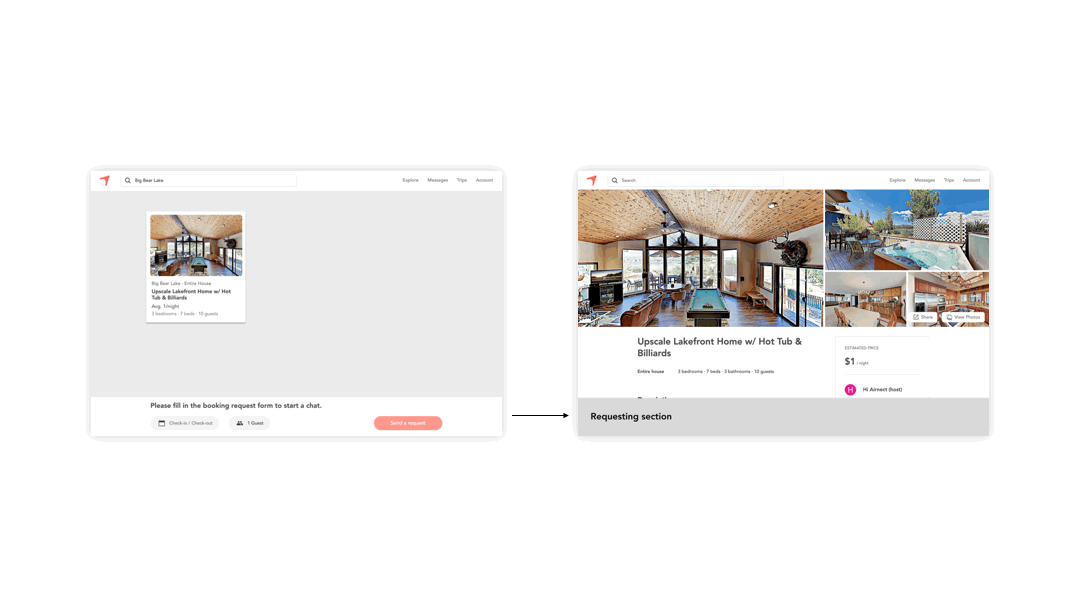
Solution 1: We combined the "Requesting page" and the "Detail page" with a Fixed bar.
The solution helps users to take fewer steps to request a house.

New floating request section that
1. reduce user flow steps
2. utilizes existing design
Solutions 2: Add a 3-step "How it works" tutorial on the listing browsing page.
The tutorial can guide our guests to finish the booking task.

3-step tutorial that is
1. easy to learn Airnect
2. give info of what to expect
Solution 3: Added system message and mainly focused on 3 scenarios
The system message answers questions about payment security.


New system message that
1. answers guests question
2. provided additional info
background
My Role
As the UX leader, I led the data research, designed the optimized user flow, wrote copy with the marketing manager, and worked with the UI designer and engineer to make those movements come true. Our UI designer drew the prototype and made the final design for our solutions.
To comply with my non-disclosure agreement, I have omitted and obfuscated confidential information in this case study. All information in this case study is my own and does not necessarily reflect the views of Finpeak, Inc.
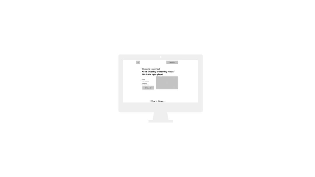
What is Airnect?
Airnect.com is a flexible rental platform that helps guests like traveling nurses and intern students to find a flexible weekly or monthly furnished space. Hosts can list and rent their space.
Importantly, guests can negotiate the price with the host on the chatting page.


User(guest) goal
Find a desired weekly or monthly house and book it at a reasonable price.
Our business goal
Generate more transactions to get service fee as revenue.
To solve the business challenge, first,
we want to figure out which booking user flow went wrong.
🤔
research | which parts went wrong
User flow (funnel)
In Google Analytics, we found the funnel of user volume decreases a lot as the user goes through.

Guest booking flow
Guest Volume
Landing page
Listing page
Requesting page
Detail page
Chatting page
1
2
Findings
Significant users dropped off after the "Requesting page."
Users switched between the "Requesting page" and "Detail page" frequently.
1
2
Original flow: here was the original booking flow


Step 2: click the box to see detail
(requesting page)
Step 3: Click "Send a request"
and go back to the previous page
(detail page)
Step 4: Make a request
(requesting page)
Step 1: Choose a home
(listing page)

The problem hypothesis:
The "requesting page" is redundant and took too many clicks to finish the task.
We summarized this problem as:
Problem 1: Redundant page
This led to our first question.
How might we make the booking flow smoother so that guests can take fewer steps to see the detail page?
Quantitative research - user survey
With 30+We have calculated the response rate of guests replying to the host’s offers. One main result we found was that most guests (about 80%) didn’t respond to hosts, especially when a host sent a quote.


Our hypothesis:
Guests don't know that they can negotiate the price. They may thought that they have to pay immediately after the host send an offer. To conclude, our guest don't know how Airnect works.
That can be our second problem.
Problem 2: Lack of product guidance
How might we improve the onboarding guide, so that guests know what they can expect to see and do throughout the process?
Qualitative research - interview
Continue from the survey. We wanted to dig into our hypothesis so we called 10+ guests and ask what are the concerns. We summarized 3 typical concerns.
I don't feel comfortable seeing offer? What do I suppose to do with this?
I don't know the host? How do I know it's not a scam?
I am not sure how it works. I afraid that I will lose money after I pay.
Problem hypothesis:
Our guests have concerns about payment safety. They trust neither the host nor Airnect.
Problem 3: Payment concerns
How might we let the guest know it's safe to pay on Airnect
so that guests can eliminate their concerns, continue the process and chat with hosts?
design goals - refine the hypothesis
As we summarized 3 problems, we can see where the problems occur in the user flow.
Landing page
Listing page
Requesting page
Detail page
Chatting page
Problem
Lack of product guidance
Redundant page
Payment concerns
Design goal
We want to let the guest know how it works by using a tutorial.
The original booking flow may be extra and unhelpful. We want to simplify the flow - may has extra and unnecessary pages.
Since the payment concerns mostly appears in the chatting page. We need to give enough info for our guest about why it's safe to pay on Airnect.
design rationale - how do we choose ideas
Before we start, it's important to know the constrains and the design concept
-
With a tight schedule and limited resources(we were a small team), we needed to move quickly and develop minimum viable products (MVPs).
-
If the guest can't 100% trust the host. We as a platform need to earn trusted for guests and hosts. So that both parties can rely on us! We solve issues for them so they don't have to argue.
Airnect
Trust
Host
Trust
Guest
We brainstormed ideas after reflecting on our insights findings.
The design goals guided us to the solutions.
ideation and solution
Lack of product guidance
Design goal: A high readability tutorial
Ideation - booking tutorial
Option 1 - single page tutorial
Option 2 - multi page tutorial
Option 3 - Video tutorial
Option 4 - Refresh landing page

Option 5 - Pop-up window (our choice)
Add "How it works" tutorial. It will be triggered after a new guest sign up and get to the listing page
We chose Option 5 - Pop-up window because
-
Easy and fast to build in terms of our tight schedule.
-
Sustainability. Easy for future revise and development

Popup booking tutorial flow
Step 1: Finish signing up
Step 2: Tutorial automatically pops up
Final design
Add a 3-step "How it works" tutorial on the listing browsing page. After a guest sign up, the tutorial pops up. Guests will know what's going on next.

Why is the pop-up message at the bottom instead of in the middle or up?
Popping up from the bottom to us is a more friendly way for us. We can deploy the design ASAP and iterate it.
Redundant page
Design goal: Reduce and simplify the booking steps
Ideation
We want guests to get to the detail faster. Our team agree to simplify the original flow. But we have 2 options to achieve the goal.
Option 1: Delete the first "Requesting page" and remain it after the "Detail page.

Option 2: Combine the "Requesting page" and "Detail page."

We chose Option 2 because
-
Simplifies the booking process.
-
We can use the element that we already have. No new design needed.
Requesting page
Detail page
Wireframing
Final design

We combined the "Requesting page" and the "detail page" so guests can easily see the housing detail and decide what to do next - avoiding back and forth.
The requesting section now is a fixed menu in the bottom of the detail page
Backup plan
1. Do the same way as Airbnb, put the request section on the side with the "Price detail."
2. Explain more about the "Send request button" because not everyone knows what it means after sending the request. Will there be any commitment? Is there any cost for a request?
Payment concerns
Design goal: Answer questions about payment
Ideation
On the chatting page, we want to put more annotations (system message) on the guest end and provide them with relevant info on how we protect guests' benefits. This may solve most of their concerns, such as deposits or payments.
Problem with original system message

Sample of original system message
YOU SENT A BOOKING REQUEST
BOOK NOW OR FURTHER DISCUSS WITH HOST
BOOKING CONFIRMED
Problem
-
All caps sentence, low readability
-
Important, but not useful
For new system message we want it to
-
give info about payment safety
-
be have a friendly and considerate tone
-
provide optional info (deposit)
Final design
For the final design. We added system message and mainly focus on 3 scenarios:
-
When request sent
-
When offer received
-
After you pay

When request sent
Let the guest know the safe way to pay
solution expectation - what can they solve
Reflecting 3 solutions to the user flow, we can see what it solves.
Landing page
Listing page
Requesting page
Detail page
Chatting page
Solution 3: Add and revise system message
Expect to increase the response rate
Solution 2: Simplify the requesting flow
Expect to decrease the drop off rate in this page
Solution 1: Booking Tutorial
Expect to decrease the overall drop off rate
impact - what we get from the solution
Positive feedback (revisit the interview participants)
1. “It makes more sense than before. Now I know I can negotiate the rent.”
2. “I think the new system message is helpful. It explains a lot of information and makes me trust Airnect more.”
Data tracking
Since it's hard to read which page did users quit on Google Analytics, our engineer team start to set data point on every website page. In the future we can easily know which page do our guest quit the most.
Personally, I collaborated with our engineer to learn simple SQL commands to access the data dashboard that helps me to analyze data.
Future project
The option 4 (refresh the landing page) for tutorial became our future project that helps our guest to learn more about Airnect.com in the landing page, before they sign up.
Here is the overview of the new landing page.

self-reflection
What can we do better?
We didn't have a chance to track the design effect after we finished the project. If I were to measure the design success, here is what I would do.
For overall platform stats, I will check
-
If our booking rate increases by at least 10%.
-
If the chat response rate increase by 20%.
For the booking flow, I will pay attention to
-
The before and after drop rates in the requesting (detail page).
-
Guest‘s length of stay in the tutorial
We can also interview the previous participants and see if they satisfy with the upcoming new designs.
What can go worng? What to improve?
Tutorial
We only made a simple tutorial. Guests can only see it once, then it disappears. We should explore the most efficient way to lower the education cost for guests.
System Message
As we grow, we want to collect more potential questions that our users (guests and hosts) have. And continue to add the most relevant system message.
What I learned?
As the UX lead, I initiated the project and wanted to help the platform grow. Before this project, I had more proposals that our director did not approve. I started to figure out what the company needed at a different stage.
Our director named this project: E-pay. I learned more about collaborating with designers, engineers, and copywriters during the designing process.
I am glad I can lead this project and see the final design launched.
Final Design Presentation
Booking Tutorial
Never get lost. After the account registration, the tutorial will let you know what's going to happen and what you can expect.
How to trigger the tutorial?
Step 1: Sign up for an account.
Step 2: Jump to the listing page, and the tutorial will automatically pop up from the bottom.

New system message
Answers your questions before you even have it .
We want users to feel we care about their benefits, including payment safety and privacy. Before the project, the system's message was not a humanized design.
With our new system message, guests can clearly know where the payment goes, how the deposit works, how we protect privacy, etc. It also lowers the pressure on customer service.
When request sent
Let the guest know the safe way to pay
Requesting your desired home simply
We remake the booking flow so that it's more natural for guests.
The new flow saves 10 seconds more than before in the booking process,
with no confusion.
